Introduction
For my media project, myself and Jane Keegan worked together to produce two minutes of the opening sequence of a film. We shared the work equally and did not disagree with the ideas that we thought of. The editing and choice of settings were done together, but I did the acting in the opening sequence, and produced the non-copyright music that is heard throughout the film, while Jane concentrated on the filming and directing.
1) In what ways does your media product use, develop or challenge forms and conventions of real media products?
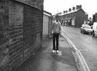
The genre of our sequence is social realism. We worked upon the conventions of this genre in order to get the reaction we want from the audience. The main audience in college are teenagers and teenagers tend to be more interested in social realist films. Myself being the protagonist and a teenager reflects the teen aspects of this genre, with a teenager who feels the sense of regret after running away from problems and thinking thoughts of happiness and misbehaviour in the past. We showed the past and present clearly in the sequence as effects and black and white footage shows the past, and coloured footage shows the present. Another way of dividing past from present is the change in my hairstyle as my hair was short in the flashbacks and was long when I was shown running and thinking.
Due to the fact that the scene we filmed is an opening sequence, we have made sure that these two minutes of film include the conventions that are normally included in other opening sequences related to social realism. To ensure this, we have set the scene in alleyways, shops, working class locations, in order to meet this goal.


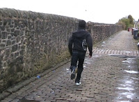
As the protagonist is introduced in the first few shots, the audience are given the first taste of the genre of social realism. This is given to them by the first settings of the sequence, the casual wear of the character, the cobbled ground in the alley, and the non-diegetic upbeat background music. In order to make the audience think and create a sense of mystery, enigmas are used in the first parts of film to ask why the character is running and what is he running from.
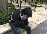
Also, when the character is sitting down in thought, the camera is above him in order to make him look weak in this part. The flowers behind him in the cinematography create some sympathy for the character when he is sat there thinking. However, in a flashback when he is walking cocky, the camera angles make him look superior and the body language makes him have the attitude that he should'nt be messed with.
After screening our film to an audience of similar age to our target audience, we found that the majority of the feedback was positive. However, one person did not understand the elements within this opening sequence.
2) How does your media product represent particular social groups?
Our opening sequence concentrates on teen social groups and life in certain societies, thus having a teen as the protagonist of this film. The characters hoodies, worn out trainers and body language reflects this image we have created to perfect this view of social realism.
The cinematography and backgrounds of these shots include working class terrace houses and the typical kind of street of Northern England. To give this film its hybrid taste, we have made the music quite gritty but to match the type of music that a teenager would listen to. The terraced housing, clothing, etc give the view of social realism, but the protagonist himself and the music shows aspects of teen drama.
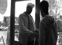
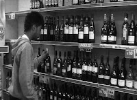
The walking of the character in the flashbacks suggests a rebellious attitude. The short hair and the black and white background make this stand out. Only at the end of the sequence do we hear a bit of speech from the character that is not clear enough when he is found stealing a bottle of wine from the corner shop. The voice of the shopkeeper searching him overlaps the voice of the protagonist and this creates a sense that he is not as high and mighty as he thinks he is.


3) What kind of media institution might distribute your media product and why?
Products which are of a similar type to "So Weak" ( My Product ) have been made by other British filmwriters and directors such as Noel Clarke and Menhaj Huda making successful hybrid teen drama/social realism films in th UK, e.g. Kidulthood (2006). This movie contains troubled teenagers and working class locations, similar to the cinematography in the product that me and Jane created. This is the same in Adulthood (2008), directed, written and starring Noel Clarke. The opening sequence includes music of a similar style to ours as it is the type of grimey upbeat music that teenagers "rave" to in these areas.
The UK film council presented the movie "Adulthood" and I believe that the storyline of our product would be backed up by similar companies if we consider making a full movie. The shots we have used, flashbacks etc have been done in a near professional style to make the audience relate more to our opening sequence.
4) Who would be the audience for your media product?
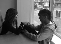
The target audience that we expect to watch and enjoy our product would be of an age between 15-30, as the main characters of the film are within that age range. Also, people within that age would understand the sequence more as they tend to be more into teen drama/social realist dramas, and also the music within the full two minutes is the type of music that would be enjoyed more from people aged 15-30. We have used a style in our flashbacks when the protagonist is thinking about the past to get more female viewers hooked on, as there is some elements of love and romance within the film.

However, we expect more male viewers to watch this film as the sequence is focusing most on the male protagonist and male people between the ages 15-30 tend to enjoy watching shoplifting, crimes and rebellious attitudes of a character in these types of movie.
The cinematography includes working class housing, northern English streets and British places, which show that the audience will be more of a British ethnicity than other backgrounds as this audience will understand the British scenery and ways of life in Northern England more than any other type of audience. "Adulthood" is a recent British movie and is similar to our product in many ways. Our product may be financially successful as Adulthood has gained worldwide success and has international and worldwide gross of $5,922,805 (Ref: http://www.the-numbers.com/movies/2008/0ADHD.php) . This has given us confidence that our product may do as well if released.
5) How did you attract/address your audience?
We attracted and addressed our audience in many ways in order to keep them hooked on to the sequence. We have done this successfully by using different techniques, such as running, flashbacks, regret, being rebellious and being happy. To make this stand out we have put in different effects such as black and white footage for the flashbacks, pictures for the happy past, and body language to show the rebellious character of the past. Also the division of past and present time in the sequence stands out significantly as the present is in colour and the protagonist has long hair, but in the past, the shots are in black and white and the protagonists hair is short. The chronology of the movie is not in any order as in parts of the sequence go from present to past when the character is in thought.

To address the names of the main characters of the film to the audience, we have included captions and titles in the first few shots of the sequence. At the end of the sequence a black background shows up with a white title saying the movies name "So Weak" to show the audience what the film is called. The reason the film has this title is that it matches with the music I have produced and shows the audience that there is weakness in the protagonist and he has to overcome this when he is thinking of the good and bad life in the past. Tension is built in the sequence by the characters actions and the music in the background that is mixed in to change when tension is building or it is calming down.
The message that our sequence suggests about crime and this lifestyle portrayed here is of a stereotypical aspect as teenagers tend to shoplift more than adults in modern society. This is effective in our piece as the flashbacks of the protagonists joyful life was shown in photographs, but the bad flashbacks was a chunk of film showing the character shoplift a bottle of wine and get caught.

To appeal the audience even more, we have put that the director of the movie is "Saul Gibb", as he is popular and many people like to view his movies. The music and sound is produced by me but mixed in to fit in with the opening sequence as the flashbacks of the photos match with the beat of music. Our editing style is done in a way to split the past from the present, when the past is shown in the opening sequence, the protagonist blinks when he starts thinking about the past. We have used transitions to make a good effect when the protagonist blinks and put in a white fade in to the past in order to significantly divide both times from each other.
6) What have you learnt about technologies from the process of constructing this product?
We have researched about similar products in ways such as YouTube ( Viewing other opening sequences ), searching through http://www.thenumbers.com in order to see the figures of how financially successful similar products such as Adulthood and Trainspotting were, e.g. Adulthood has gained worldwide success and has international and worldwide gross of $5,922,805 (Ref: http://www.the-numbers.com/movies/2008/0ADHD.php)
we have used YouTube to view opening sequences, e.g.
http://www.youtube.com/watch?v=EZa96id7k2M
At first, we found it hard to use the camera equipment and editing technologies, but as the weeks went on in this project, we developed more skill and experience which boosted our confidence. We have looked back at our final product many times and compared it with our Preliminary task and have seen a significant improvement in our way of producing a sequence.
One thing needed to be altered in the sequence which was the music in the background, as first we used non copyright music that was too tense for a social realism film. In the last two weeks i produced a track to fit in with the product.
7) Looking back at your preliminary task, what do you feel you have learnt in the progression from it to the full product?
After looking back many times at both sequences ( final product and preliminary task ) me and Jane have seen a significant improvement in our ways of filming and editing. The preliminary task had shots that did not blend in with each other and were not that smooth. The editing was satisfactory and was too dark and the style was in my opinion, unprofessional.
However, now looking at our opening sequence that we have produced, we have seen that the transitions and editing is much more in the right pace and is much smoother that before, the music fits in very well, and over the weeks we have developed many new techniques and styles that have made our film work and be a success.
We have made the chronology in the movie more interesting by changing the colour of the shots to divide past from present life in the movie. The music has played a big part in the success in our final product as all the editing has been done to fit in with the pace of the music. Overall we have seen many improvements in our experience to produce a film.
Conclusion
Overall, I believe that the product that me and Jane created was of a higher quality than expected and we are confident that we have done a good job in our collaboration to produce this opening sequence of "So Weak". The key strengths of the film was the editing and the portrayal of northern British life and and lifestyle of the protagonist. The editing and music is another key strength as everything goes together in a smooth pace. However there are some weaknesses that we will learn from if we decide to produce another film such as the acting and the way the camera moves at times. However, I believe that the opening sequence is of a good quality and me and Jane are happy with the final product.
